Hiya, I'm Emily C. Nguyen! 😎✌️
I'm a UI/UX designer and illustrator who loves creating accessible, visually appealing experiences that seamlessly communicate the message of creative projects.
Got a project in mind?
Let's Talk About It
About The Designer
Emily Nguyen
Designer & Illustrator
"Accessibility does not always equal boring."
I'm a designer dedicated to crafting practical, seamless digital experiences. My work focuses on creating inclusive, minimal, and user-centered solutions that connect with people and spark inspiration.Currently based in Austin, TX, I work as a freelance illustrator and designer. My expertise spans UI/UX, visual design, illustrations, and marketing assets.Over the years, I’ve built a versatile background across gaming, social media marketing, sales, and operations. I thrive when collaborating alongside creative and technical teams, bringing prior leadership experience in team management and training to every project.In my spare time, you can usually find me hanging out with my neighbor's cats and attempting to touch grass—despite being severely allergic to both. /hj

Clip Studio

Figma

Photoshop

Illustrator

Canva

HTML5

Tailwind CSS
Relevant Experience
Freelance Designer & Illustrator
2018 - PRESENT
Independent Clients
Delivered 400+ art commissions, demonstrating a strong rate of repeat business and referral clients across personal and commercial sectors. Produced creative and technical deliverables, ranging from visual game asset development and merchandise production for large-scale conventions to front-end web coding and user-friendly code templates.
JAN 2023 - JUL 2023
Skiff Digital Marketing Agency
Designed comprehensive marketing and branding assets for 10+ companies, establishing visual identities through logos, web designs, and brand guidelines. Created a variety of digital content including social media posts, email newsletters, infographics, video thumbnails, and promotional banners.
MAY 2022 - DEC 2022
Worldwise Tutoring
Collaborated with a cross-functional intern team to design weekly social media content aimed at expanding WWT’s brand reach. Spearheaded key creative initiatives while serving as lead designer to pitch new ideas and produce over 200+ high-impact marketing assets.
MAY 2022 - DEC 2022
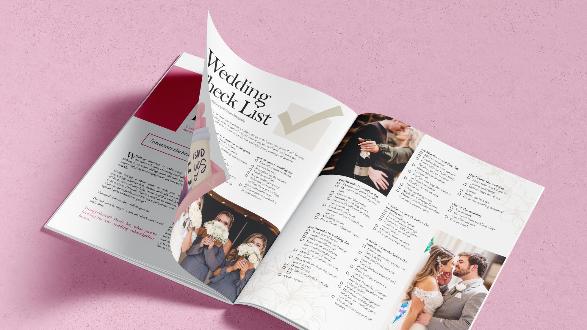
Northeast Ohio Weddings Magazine
Partnered with student writers and designers to publish a monthly magazine dedicated to inspiring engaged and newlywed couples.
Education
ELVTR
DEC 2025 - FEB 2026
UX/UI for Gaming with Ivy Sang
University of Houston, Clear Lake
2019 - 2022
Bachelor of Fine Arts (Graphic Design)
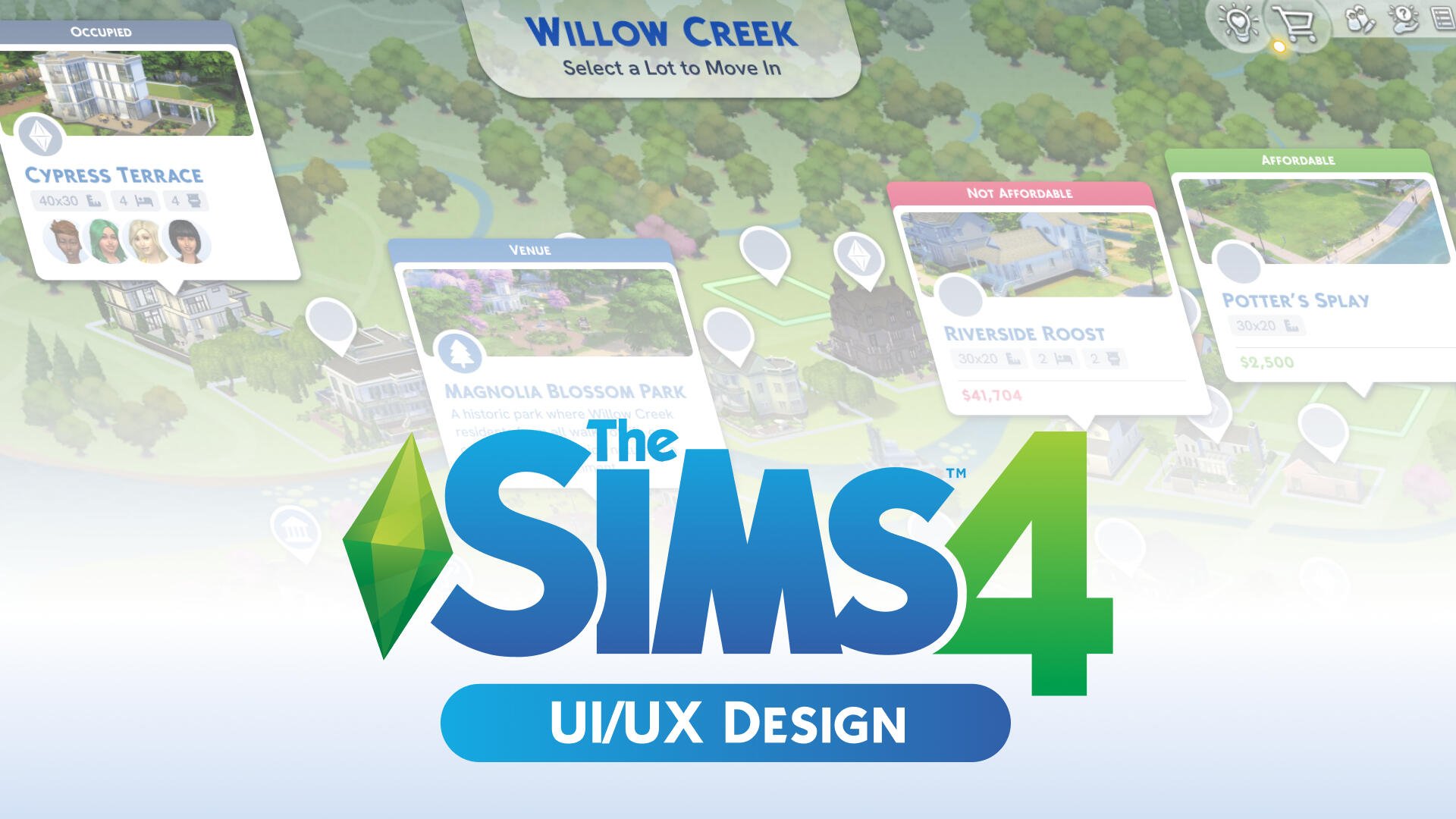
The Sims 4 UI/UX Redesign
TIMELINE
NOV 2025 - FEB 2026 (12 weeks)
TOOLS
CLIENT
ELVTR
SKILLS
A UI/UX redesign of The Sims 4 desktop edition, focusing on improving onboarding and accessibility for new players while preserving the core visual identity and design philosophy established by Electronic Arts.

Overview
1. About the Project
This project was created in a span of 12 weeks under the guidance of Ivy Sang (UX/UI Director for Blizzard) and Jacob Lee (Visual Design Lead at Riot Games). It was my class project throughout the duration of ELVTR's UX/UI for Gaming course.

Challenges
Time constraints: The project was developed during a busy holiday season, requiring smart time management to balance multiple ongoing projects.
Navigating a new discipline: I navigated a steep learning curve to sharpen my Figma workflow and adapt standard UX principles to a gaming interface.
Limited knowledge of the game: Designing for a game I had not previously played required me to step outside personal bias, relying heavily on user research, playthrough analyses, and player feedback to quickly master the core mechanics.
2. UX Planning
Player's Journey
To kick off the redesign, I mapped out a player journey to understand the intersection of developer intent and player experience. I analyzed the first few minutes of gameplay to identify and solve onboarding friction points.


Paper Prototype
Based on what I learned from the Player's Journey, I create a paper prototype to determine the hierarchy of options I intend to convey on each screen.

Flow Chart
The ideas were further expanded into a detailed flow chart to present all the different options available on each screen, while highlighting the relationship between them.

Wireframes
My initial wireframes drafted in Clip Studio Paint.


3. Usability Testing
To validate the effectiveness of the redesign and ensure the wireframes solved core onboarding friction points, I conducted a round of usability testing with three participants representing the target demographic.
Test Preparation
To ensure consistency, I established clear research objectives and testing logistics prior to execution. I followed a standardized script to easy replicate the test and collect unbiased data across all participants.


Test Results
Although I ran into a few unexpected bumps, the usability test provided actionable feedback that directly informed the next iteration of wireframes.

Reiterated Wireframes
With the knowledge I obtained from my usability test, I iterated on the wireframes to directly address player friction. The updated layouts were then into Figma to establish higher-fidelity UI components.

Swapped share and save image buttons positions.
Changed “Share to Gallery” to be bigger.
Added an info icon next to the share gallery button to explain what the Gallery is.
Change “Share your Household” to “Share your Sim(s)”.
Added option to name Household.

Removed markers from the map (I go back on this decision after realizing the markers are necessary on the detailed 3D map).
Indicated what characters are living inside the occupied households + say that it’s already occupied.
Made the amenities a single solid gray.
Fixed the formatting of text in windows to have information stacked vertically.
Instead of relying on color to show if something is affordable, have text in window say you cannot afford this lot.

Changed title to “Ready to move-in?”
Got rid of the confusing flavor text below the title.

Changed the play button in the tips to be checkmarks.
Changed “Taking Control!” to “Camera Controls”.
Took out the title “Changing Camera Controls”.
Changed description to “Click CTRL + Shift + Tab to toggle alternative camera controls or check Controls and Camera in Settings for more options.”
Changed the tip windows to only show one at a time in prototype.
Added page numbers on the bottom left.
Added lightbulb icon.
4. Interface Design
UX Moodboard
My main focus was improving the overall user experience. To respect the original UI art style, I concentrated my design inspiration on component layout, visual hierarchy, and intuitive content delivery.

Credits (from left to right)
UI/UX | Relic Hunters Legend by Taty R.
The Sims 3 [UI REDESIGN] by Eva Bourdet Kovacs
UI Design - Unannounced Game by Taty R.
'Outscape' [Beyond Dark] - Artworks and UI/UX by Andrii SHAFETOV
Dashboard CRM - WIP by Farhan
16 little UI design tips that make a big impact by Adham Dannaway
UI Mockups - 1st Iteration
The first iterations of the mockups. The primary gameplay HUD remained largely unchanged. My redesign focused on optimizing the contextual modal windows and onboarding pop-ups that guide early gameplay. (Special thanks to my friend for gathering in-game assets and screenshot references!)
Unexpected Challenge
While collecting fresh in-game reference assets, I discovered my original research was based on a legacy game version. Recognizing that several target friction points had already been addressed by the developers, I made the call to pivot.I realigned my designs with the live build. Despite the time-consuming setback, it was essential to ensure my final solutions delivered true value over the current player experience.


Accessibility Test
To ensure inclusive design across all player profiles, I ran the mockups through a color blindess simulator. It was revealed that several elements/options were difficult to understand because they relied solely on color.


UI Mockups - 2nd Iteration
I made changes to two screens based on the results of the color blindness simulation.

Added a border around the selected pose.

Redesigned the Lot info windows.
Darkened the outline of unavailable Lots.

5. Final Mockups


UI Style Guide


All graphics and assets were recreated and/or designed by me in Figma except for the icons used in some of the buttons.
6. Outcome
Added more customization to the share screen.
Made the Lot information easier to understand.
Improved the overall UI while staying on brand.
Condensed the camera tutorial.
What I Learned
Improved my understanding of Figma.
The workflow of UI/UX designers in video games.
How to conduct usability tests.
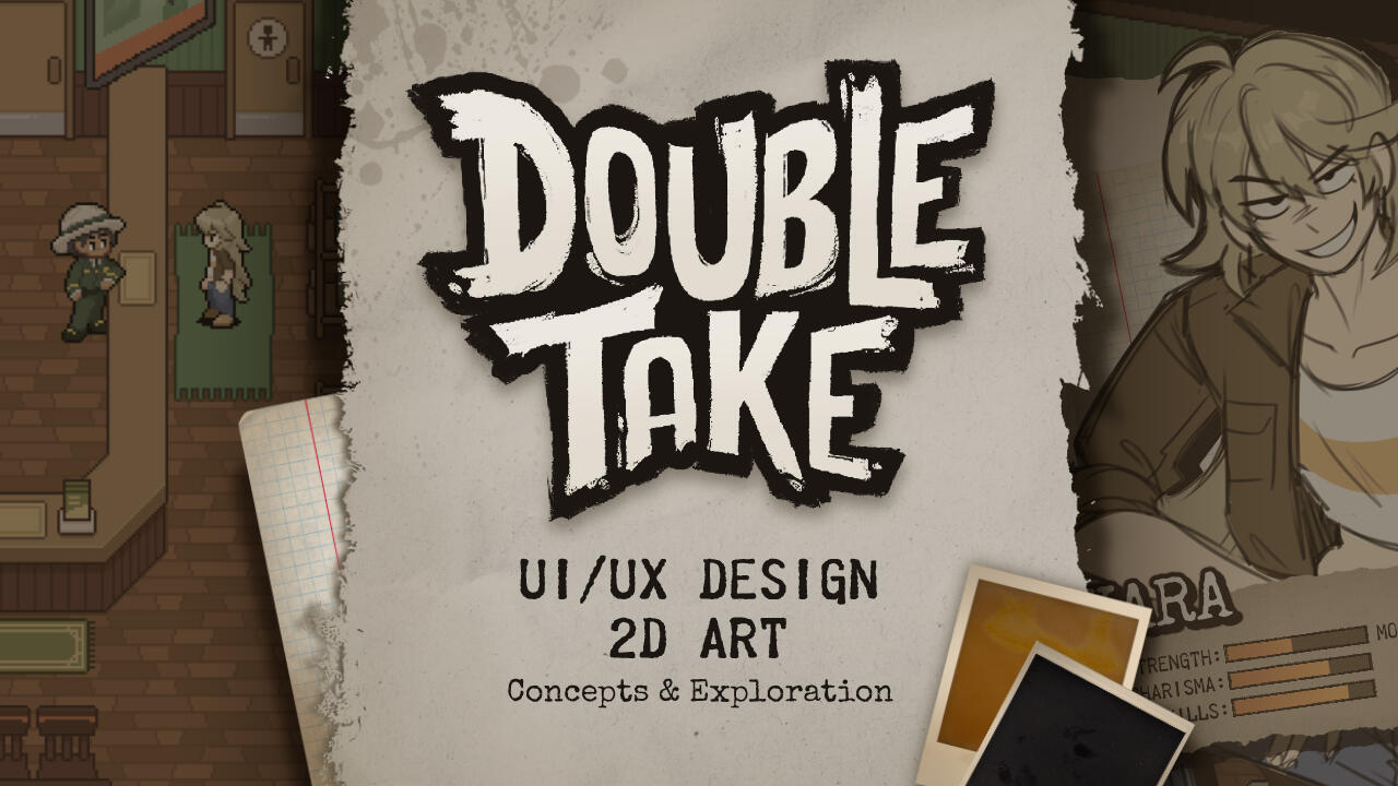
Double Take
TIMELINE
JUL 2025 - PRESENT
SKILLS
TOOLS
Yara's camping trip comes to a terrifying end when a supernatural monster steals her identity. You play as the deceptive imposter attempting to navigate Yara’s life while concealing your true identity. A horror RPG currently in development.

Overview
1. About the Project

Project Goals
My goal is to create an accessible game designed for casual players across a wide range of devices, including those with modest hardware.
Multiple Input Options: Playable with controller, mouse, and keyboard out of the box, with mobile export planned as a future enhancement.
Lightweight Build: Target under 1 GB total with fully optimized assets to ensure smooth performance across devices.
Narrative UI Design: The interface doubles as a storytelling tool, integrating story and gameplay through a unified visual identity.

Challenges and Limitations
Double Take is my solo indie project, developed within RPG Maker MZ. While the engine's script-based system makes it accessible to newcomers, it also presents specific challenges surrounding flexibility and customization:
Limited Customization: Adding custom features and menu options requires third-party plugins, and the relatively small plugin ecosystem narrows the available choices. The engine also offers no native UI customization tools, requiring a multiple plugins to achieve the desired interface.
Performance Constraints: RPG Maker MZ struggles under heavy graphical and script loads, requiring careful curation of which assets and plugins to include.
Accessibility Gaps: Common accessibility settings like volume mixing, control remapping, and dialogue history are absent from the base engine and must be implemented manually.
2. UI/UX Process
Sketches
Rough thumbnail sketches of different menu layouts.

Low-Fidelity Wireframes
These wireframes were imported into the engine early in development to check if this layout could be successfully implemented.


3. UI Visual Direction
The UI leans into a grunge and scrapbook aesthetic, designed to reflect Yara's rebellious nature.


4. 2D Art
Concept Art and Sketches


Pixel Art


All pixel art is created on a 24 x 24 pixel grid.

Character Talk Sprites


5. Final Screens


Double Take is in active development. All content is subject to change.
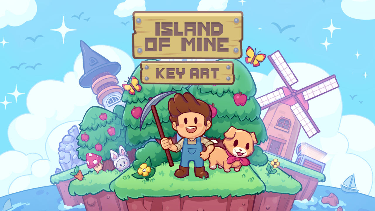
Key Art for Island of Mine
TIMELINE
NOV 2022 - DEC 2022 (1 month)
TOOLS
Island of Mine is a sandbox crafting and survival game that strands players on a mysterious, uncharted island. It has a focus on resource management, base building, and progression through open-ended island exploration.

Overview
1. About The Project
In 2022, I was commissioned by developer Bonkydev to illustrate the key promotional art for Island of Mine. Over the course of a month, I worked closely with the client to craft a versatile, flexible composition that captured the core spirit and atmosphere of the game.
2. Concept Art
The client shared DALL-E mockups to convey their vision. I used these visual references as a launchpad—translating the early ideas into a fully realized key illustration. (No AI was used in the production of the concept art or final illustration.)


The concept art next to the references and inspiration.
3. Sketches

Variations for Steam Page
During the concept phase, we considered building unique variants for each Steam capsule format. To keep the project streamlined, we focused on crafting one strong, flexible master illustration that could easily crop into other layouts down the line.

The images have been scaled down for better viewing. The pixel measurements are not true to the example image. The aspect ratio remains the same.
4. Lineart

Feedback
Feedback was delivered through weekly video calls and client-provided slide decks. During these sessions, we talked through feedback together to ensure the illustrations accurately captured their intent and creative goals.

5. Flat Colors

Feedback


6. Rendering

Feedback


5. Final Illustration

6. Post Mortem
This was a valuable experience for me as my first step into video game work. Beyond the creative work, it provided insights into client collaboration, scoping creative goals, and effectively translating a developer's vision into polished key art.
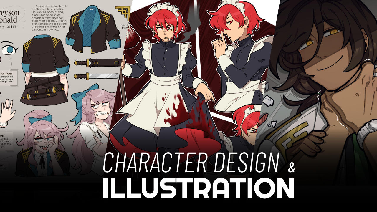
Character Design & Illustration
A curated collection of my best character design and digital illustration work.
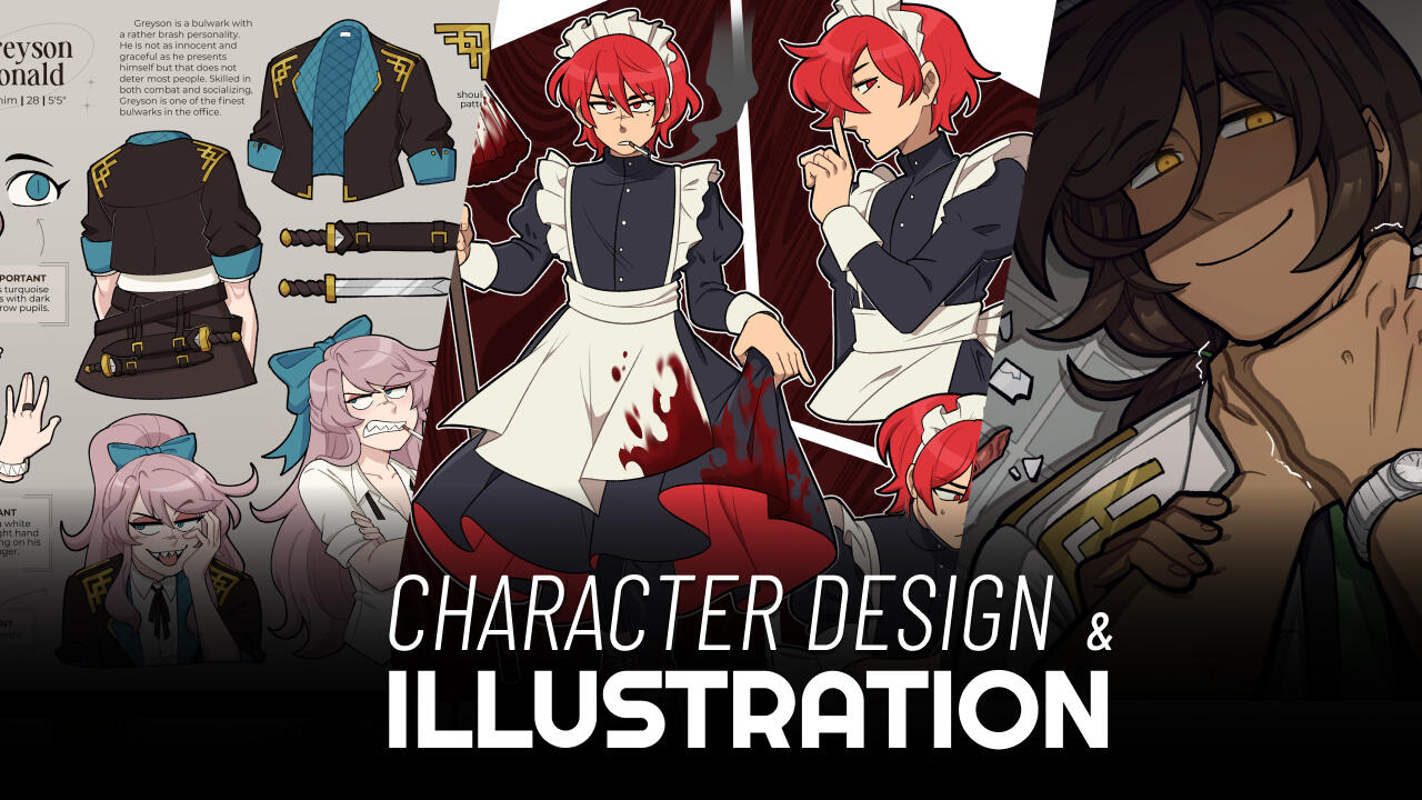
Table of Contents
Adoptables
An adoptable is an original, one-of-a-kind character design created for purchase and collection.When designing adoptables, I aim to strike a balance between broad market appeal and distinct individual personality, ensuring every design feels memorable and unique.

Gamer Girl (2024)

This character is a really popular streamer who plays FPS games. However, when she streams, her actual game is only 20% of the screen while her face takes up everything else.
Sometimes she'll start controversy on purpose with other creators just to get more viewers on her streams.
Whenever she gets into drama, she won't respond to it seriously and see it as another opportunity to promote her merch.
She does not care about anything except getting that bag!

NEET (2024)

This character spends all their time at home playing games, watching anime, job hunting, and crying about how they're not able to get a job. It's hard out here ya'll...
Has a massive collection of figurines, posters, and body pillows of their favorite anime characters.
They try their best! But their best isn't good enough :(

Bodyguard Maid (2023)

This maid was hired to do more than just clean up the establishment. Their job description also includes protecting their master from outside threats and hiding the "leftovers" from these conflicts, to put it lightly. They'll do all the dirty work to ensure their master can comfortably focus on their own work.
The person they work for is either a high-ranking criminal boss who has a lot of enemies, or just some poor unfortunate soul that everyone wants dead. Either one would work perfectly for their employer.
Despite their stoic appearance, they absolutely enjoy their work. This maid is a skilled fighter who can use anything as a weapon to defend themself. And you don't need to worry about the mess afterward, as they're an expert on cleaning!
When they aren't working, they enjoy skateboarding :)

Concieted Casanova (2023)

This character is the scumbag type. He would star in a movie where some magical nonsense forces him to become a better person in the end or his wife and child will leave him. He's that guy.
He is extremely self-centered and takes the people in his life for granted. He probably picks up women despite having a girlfriend.
He eventually learns his lesson in the end (or get a bad ending if he fails).

Tattoo Artist (2023)

The tattoos are only on the left side of her body because I want to imagine she did a bunch of practice designs on herself.
They didn't come out that good so she ended getting them all covered with waves and a fish skeleton.

Overworked Idol (2023)

A typical idol who sings pop music but has considerably less energy than those in her field.
She's an introvert who loves to sing and dance but struggles to do it for a long time. She's basically out of commission after each concert because it takes so much out of her to perform.
Due to her unique appearance she has to wear a disguise when going out in public.

Disgraced Scientist (2023)

A disgraced scientist who was kicked out of the scientific community due to their love for dangerous experiments (or maybe unethical experiments, you decide).
In the lab, they look unkempt and unprofessional with their Hawaiian shirt and house slippers. When they're attending conferences, they clean up very well because "presentation is everything!"
Her experiments are more akin to the ones you see on Johnny Test.
The test tubes on her belt aren't any dangerous chemicals, it's just soda.

Private Investigator (2023)

A private investigator that who dreams of recreating her favorite mystery TV show in real life. They grew up watching P.I.s take down criminal organizations and crazy cults.
Sadly, that is not the type of work they do. Most of their investigative work involves spying on people who think their spouse is cheating. They get involved in a lot of frivolous relationship drama.
Maybe they'll get to be the badass they've always dreamed of being someday 🥲
Illustrations
Illustrations created for friends and clients. All characters belong to their respective owners.

College Kids (2025)


Neo Eden (2023)


Art Trade with Louvel (2022)


DECIMATOR (2024)

Robin (2024)

Nariko and Natsuko (2024)

Killer Grin (2024)

Milenko (2024)

Rafael (2023)

Kasane Teto (2023)

Phos (2023)

Princesses (2023)


Bulwarks
A long-running personal narrative project exploring themes of independence, complex relationships, and desperation. Bulwarks is currently in development as an illustrated webnovel or kinetic novel.
Story Blurb
Mai, a once-revered sorcerer who protected the nation from abominations, loses their magical abilities in an accident, causing their magic to become erratic and unstable. Now disgraced, Mai is deported from the frontline to Corundum City.Before Mai accepts their defeat, mysterious incidents begin to pop up around the city believed to be caused by hemomancers, illegal blood sorcerers. Tired of sitting on the sidelines, Mai sees this as a chance to finally redeem themselves and reclaim their former glory.
Reference Pages
I created these reference pages with the goal of giving them to other artists to draw.


Illustrations

Cwen Bleh~ (2026)

Crazy Eye (2026)

CHOKE (2024)


Comics

Owen Will Never Be There (2024)

Mai is Cringe (2023)


Character Art


Sketches


Skiff Digital Marketing
A curated collection of design work created during my time at Skiff Digital Marketing, where I collaborated as the lead graphic designer within a small, tight-knit creative team.
Table of Contents
Landing Page
TIMELINE
JUL 2023 (1 week)
TOOLS
CLIENT
Jett Hayes
SKILLS
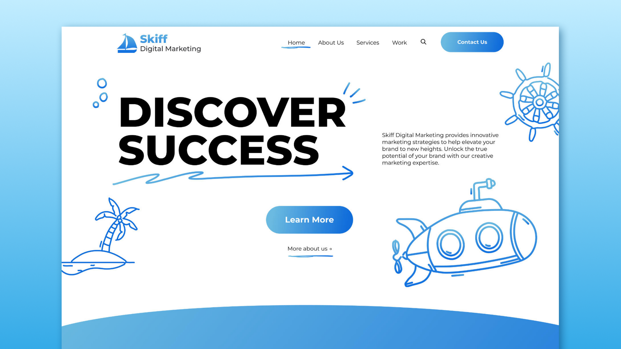
A custom landing page designed for Skiff Digital Marketing. As one of my earliest client-facing web design projects, this milestone played a pivotal role in shaping my growth and approach as a designer.
Project Goals
Create a dynamic landing page that captures the company's playful spirit while maintaining a highly professional, credible edge.

High Fidelity Wireframe
Working with full creative license, I designed a modular, content-first layout built around clarity, legibility, and effortless navigation.

First Iteration
Without an official style guide or clear creative brief, I launched the project by using the aesthetics from the existing website. My focus was establishing a clean, functional layout that could serve as a starting point for further refinement.


Final Design
Upon reviewing the initial concept, the client requested a bolder, more memorable direction. To help the agency stand out in a crowded market, we pivoted to a custom nautical theme—infusing character while maintaining a professional structure.

Boilerplate Portals
TIMELINE
JUL 2023 (1 week)
TOOLS
CLIENT
Boilerplate Portals
SKILLS
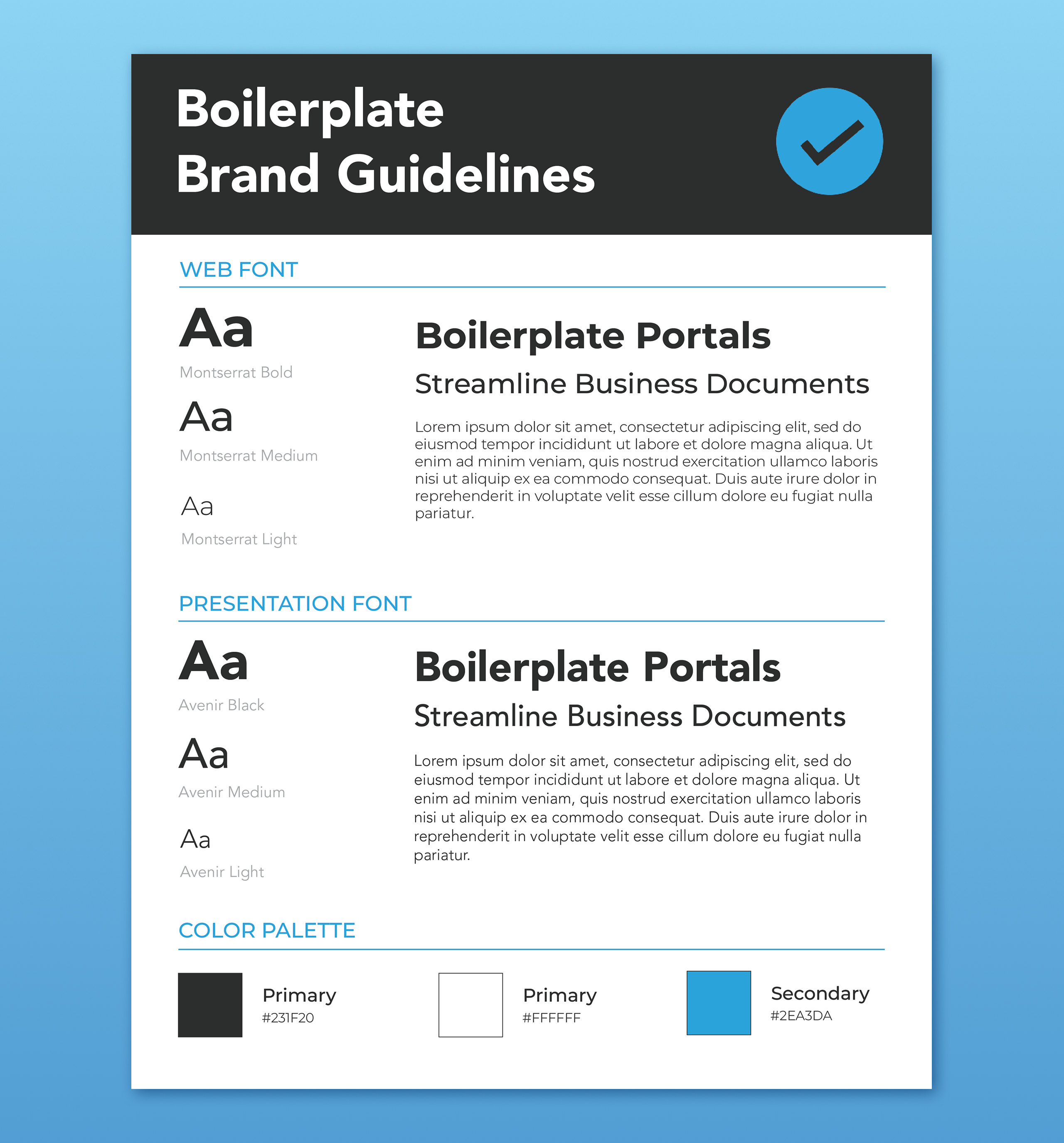
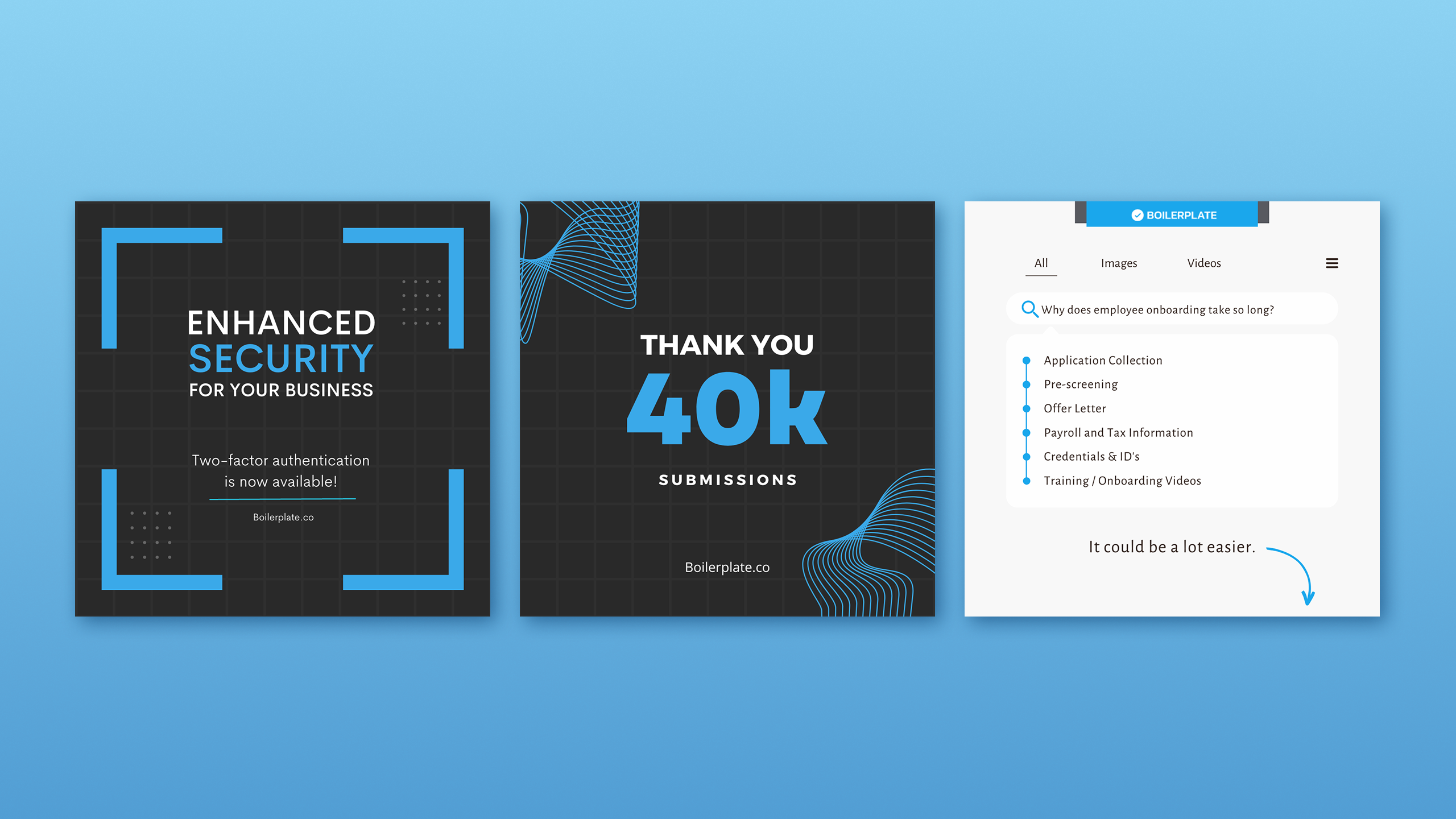
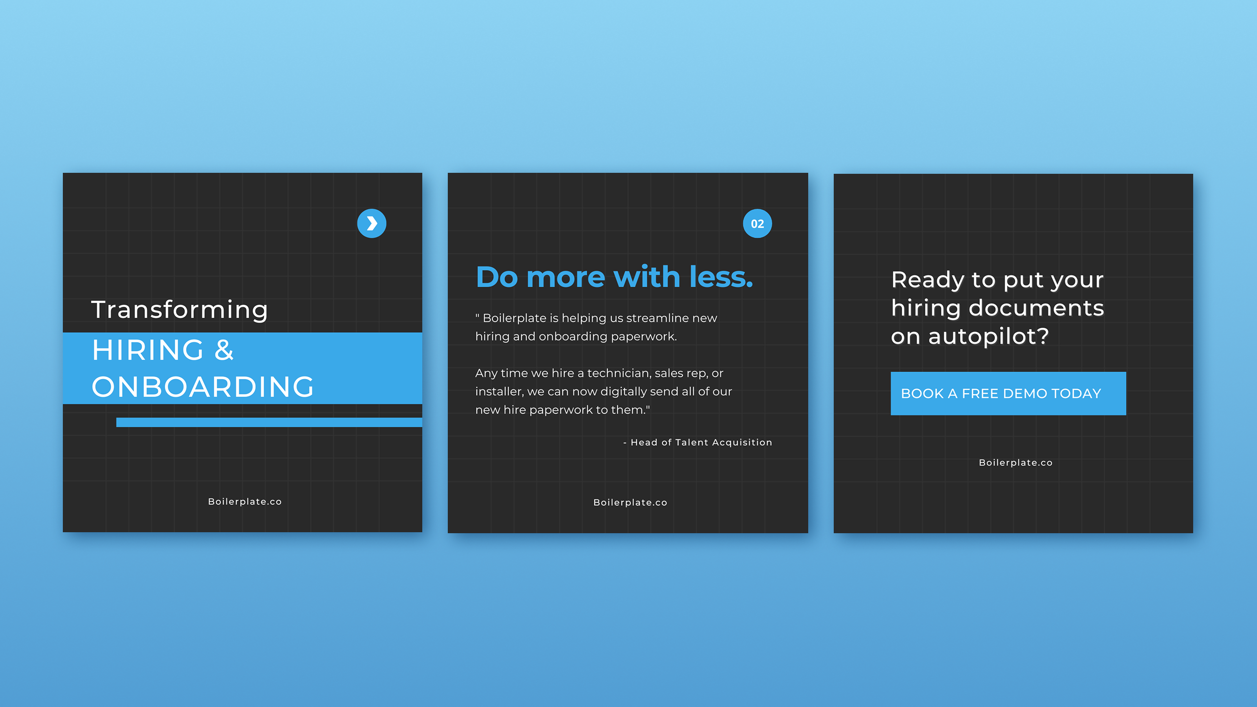
Boilerplate’s platform streamlines complex document collection, helping teams automate repetitive onboarding requests through a secure, organized, and repeatable workflow.
Brand Guidelines
Social Media Posts
Claspp
TIMELINE
JUL 2023 (1 week)
TOOLS
CLIENT
Claspp
SKILLS
Claspp bridges durability and sustainability through biodegradable phone cases that safeguard everyday tech while actively reducing environmental impact.
Phone Case Designs


Social Media Posts


Collections Page

Toyhouse Multi-Image Upload
TIMELINE
APRIL 2024 (1 week)
SKILLS
TOOLS
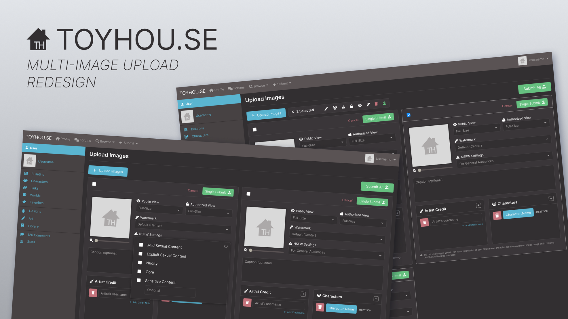
A conceptual redesign aimed at streamlining the multi-image upload experience on Toyhou.se —a dedicated character repository and trading platform for artists and roleplayers.

The Problem
Multi-image upload is marketed as a premium feature, but its clunky experience keep it from contributing to subscriber retention.
Inefficient data entry: Form fields are collapsed by default, requiring repetitive clicks to access and edit individual image properties.
Overwhelming layout: Expanded fields consume the entire screen, obscuring the broader context and making it impossible to review uploads at a glance.
Lack of batch editing: Users are forced to adjust settings individually for every image, negating the efficiency of a bulk upload tool.
The Solution
My goal was to make this feature intuitive, clear, and easy to use. I redesigned the layout to prioritize ergonomics and cut out unnecessary visual clutter.
Change 1 → Condensed upload properties.

Removed collapsible menus so all image properties are visible at a glance, eliminating unnecessary clicks.
Change 2 → Reformatted uploads into responsive grid layout.

Replaced the tall vertical list with a multi-column grid layout, making full use of screen real estate and letting users review multiple uploads simultaneously.
Change 3 → Added ability to batch select & edit.

Introduced multi-select capability to let users edit properties for several images at once, drastically reducing repetitive manual entry.
Final Design


Northeast Ohio Weddings Magazine
TIMELINE
MAY 2022 - DEC 2022
TOOLS
CLIENT
Barbara Stitzer
SKILLS
In 2022, I served as a graphic design intern for Northeast Ohio Wedding Magazine, a monthly publication that helps engaged couples and newlyweds bring their dream ceremonies to life.


WorldWise Tutoring
TIMELINE
MAY 2022 - FEB 2023
TOOLS
CLIENT
Lindsey Wander
SKILLS
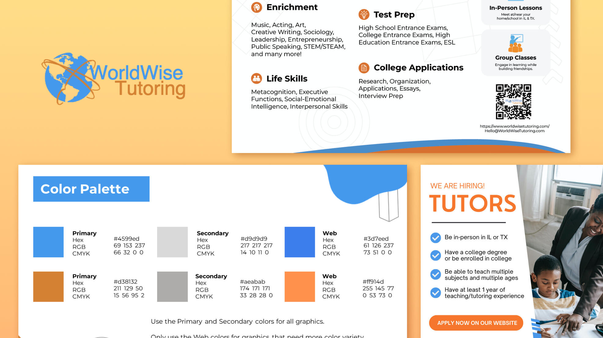
WordWise Tutoring connects talented tutors with families across Texas and Chicago. Using their proven 'I Do, We Do, You Do' approach, they deliver tailored support that helps every student thrive.

Brand Guide


Social Media Posts


Flyer


Get in Touch!
Have a project in mind? Submit your proposal through the form below, and I'll get back to you shortly with my availability.